Those of us with digital cameras are advised to shoot in RAW and convert to B&W post-camera. Best of all though by shooting RAW & JPG on a monochrome setting I get to see the tones and have an idea of what the RAW conversion will look like.

Often though I do not do anything with RAW files because my software cannot transfer them via Bluetooth & needs a physical connection (which I have but do not always use). Partly too, because I do not fully understand colour as B&W and so make do with the JPG outcome. Now however is as good a time as any to stretch my knowledge.
B&W images rely just as much if not more, on complementary colours for contrast otherwise some hues can all resemble each other and the greyscale image becomes flat – these are RED:GREEN; BLUE:ORANGE; YELLOW:PURPLE.


Looking at how colour filters work with B&W has also helped me to understand the complementary relationships – (these are simulated in Lightroom)


Do we with DSLRs need cool or warm colour filters?
With editing software the answer is superficially no but “since digital photography is all about the intensity & quality of light, lens filters are often necessary to modify the light before it enters the lens.”*
Even post-processing cannot improve poor lighting
And of course B&W greyscale is not the only monochrome (one-colour). Added to that are all the tints of sepia or selenium as well as split toning the lights and darks in other hues.

The Tidemill, Woodbridge – sepia filter 
Flower stall Kings Cross – sepia monochrome 
Acer summer foliage with soft sepia filter 
Hepworth sculpture with vintage sepia filter
Often where glass and sky meet the outcome is a natural monochrome

Tate St Ives – Cornwall 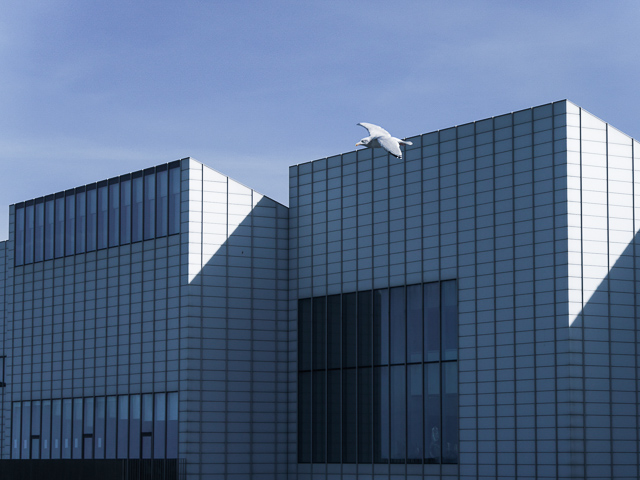
Turner Gallery – Margate 
Kew Gardens Palm House in winter blue sunshine 
Hepworth Scultpture in natural light- Tate St Ives, Cornwall
* see "Lens Filters Explained"
Image quotes from "How to Use Colour Filters in B&W Photography"
Introspectives: thinking out loud with an aim to improve and learn more about photography. Hence the images are not always for show – feedback is welcome.
And thanks to Patti & this week’s Lens Artists Photo Challenge for the opportunity to look at Monochrome

Interesting, all of it, but unsurprisingly I love your “when glass and sky meet” series most of all. 🙂 And in the case of the three photos where you add the colour version? I prefer all of them in colour. And finally, just to mention: well done for using the (new for me) gallery option with the colourful background. This is the first blog where I see it used beside my own. 🙂
thanks Manja – they were just colour swatches to illustrate complementary colours. Just seen the colour background option in galleries so giving it a go – are we ahead of the pack? 😉
Hihi, indeed! 😀
Thanks for this. I shall certainly have a play with the different filters. Like MMM I also prefer the colour versions in the contrasting images, and the final jpg is perfect!
learnt a lot about colour using the Lightroom filters Jude so glad you found it useful too. I like that final simple greyscale JPG – saw it in Hepworth’s St Ives garden & museum
Thank you for passing on all these insights, Laura. Like Manja, am especially drawn to your sky meets glass series.
thank you Tish – monochromes are there for the asking if we only look. Just have to learn to differentiate hue, tint, tone and shades in the mono colours!
Wonderful tips for those of us (me) who don’t use filters, but may some day. My eyes were really drawn to the Tate St. Ive reflection image. Thanks for sharing your thoughts on monochrome photography. 🙂
My pleasure Olga – even when we do not use filters we at least know what they do now! The light in St Ives is a real bonus for artists and photographers and that day at the Tate was no exception
Well now you’re just showing off Laura (meant as a supreme compliment for this beautiful post!) Honestly we could call it a tutorial on how to achieve best effects in B&W. Superb, really.
thank you for the ego-bolstering compliment Tina ❤
I could not pass up the opportunity to do some learning as I tend to favour B&W and needed to improve the impact of so many of my photos
Well-deserved Laura. It was one of my favorites of your always excellent posts
Now I am all aglow with a warm filter 🙂
Great insights and explanation, Laura. You really show the power of monochrome and the impact of the filter settings. I use Photoshop, but more and more people are telling me I should use Lightroom. I really enjoyed your “blue on blue” shots as well as the shot of the line of people. The light and texture of their clothes really comes out in monochrome. Great post!
I use both photoshop & lightroom – the former mostly for processing RAW and the extreme of photoediting with arty effects. Lightroom is my eveyday workhorse. Thank you for this excellent prompt Patti – it upped my learning.
Wonderful!
Thank you for sharing your insights and giving tips, Laura! And the whole post is a joy in photography. So well done.
many thanks Leya – I enjoyed putting this together and re-examining some of my archive in new lights!
Good for us all then!
I especially love the contrast in the first one!
virtually no adjustment necessary because that light was so good 🙂
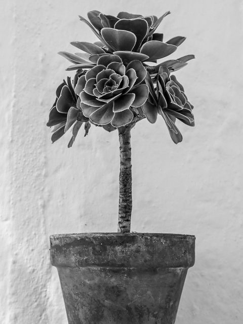
The potted plant is gorgeous!!
I like that shot too – thank you ❤
Such a terrific post, Laura. I appreciate the clear and straightforward way you illustrated the filter effects. The toner examples you have are a real knockout – the Tidemill, foliage, Hepworth sculpture and all the architectural images are superb. I should stop myself more often and check to see what a composition might look like in black and white, but typically I shoot in RAW and use Lr of SilverEfex to convert to B&W later, if the photograph looks like a good candidate. My camera does have some in-camera B&W effects with different colored filters – it would be good to play with those, too. Endless permutations are possible, right? 🙂
thank you – I really appreciate your appreciation – this post is supposed to help me choose what would make a good candidate for B&W – so much to learn, so much to choose from – Right on!