Beauty dies: that is the source of creation…
Hyacinth ~ Louise Glück
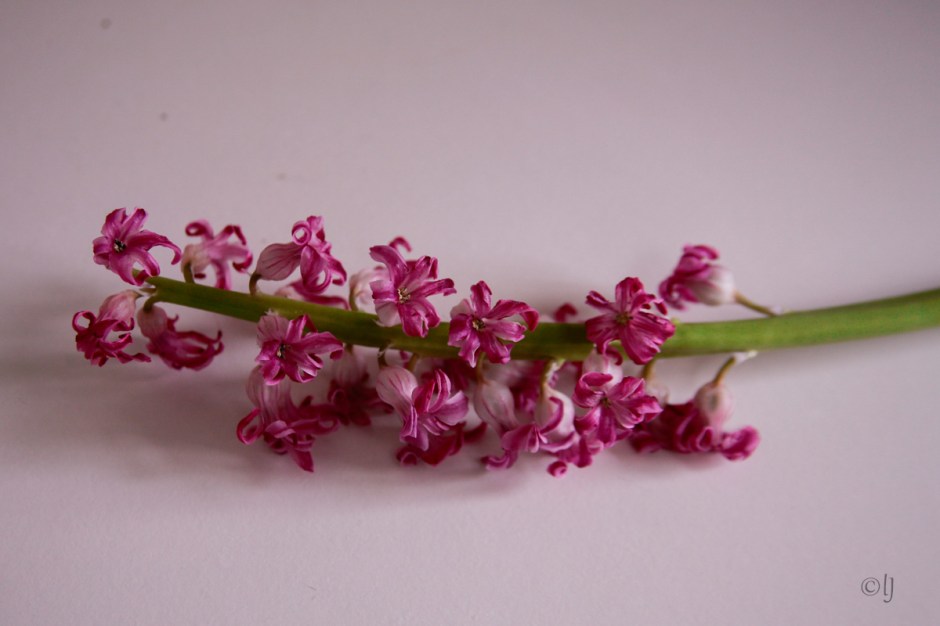
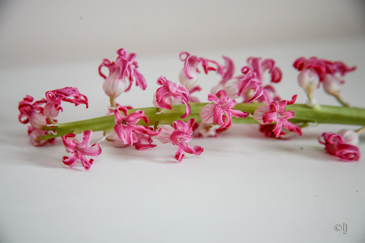
I was just about to discard this stem of an aged pink hyacinth when the swelling shape of the spent flowers caught my attention. Once blooms are past their peak they develop that wabi sabi allure of attractive imperfection and also in becoming less organic offer up a more artistic interpretation to our eye .
So I took the Canon EOS 5D with a 1*magnification lens and having snapped a few attitudes, made use of some of Lightroom’s presets. [each image can be zoomed with one click]
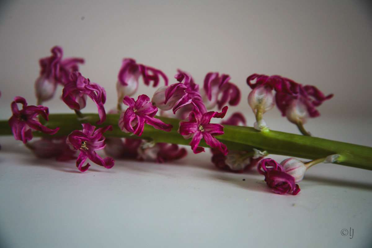
“Not every photo has to mirror reality. Sometimes, adding a color cast can change an image’s entire mood and tone”.
“Tints, casts, and colorful subtexts are a powerful way to create emotional images”.[source]
It may seem perverse but I’m quite often drawn to converting the prettiest, most vivid of colours to their neutral desaturation. It gives emphasis to form in B&W and the warmer tones of sepia lend a touch of nostalgia
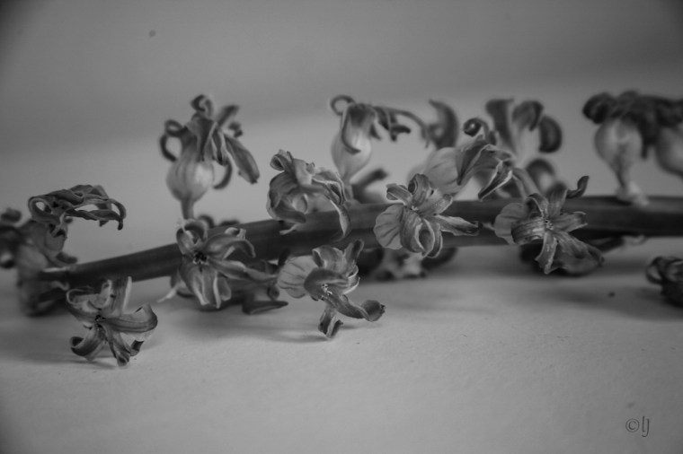

Like any monochrome conversion, when it is done well, the subject and our inbuilt perception of what it’s supposed to be and look like, almost become irrelevant [source]
A retro colour palette, being a throwback to a certain time period underscores the lost youth of faded flowers

“Folded eyes see brighter colours than the open ever do”. — Elizabeth Barrett Browning
Fun Fact – in the pink saying refers to ‘the best of health’ but at one time it had a broader meaning of ‘the very pinnacle of something’,
~~ Friday Flowers ~~

Wabi sabi! I recently read and thoroughly enjoyed what I guess I would call a coffee table book called “Wabi Sabi” about a cat with that name who goes on a quest to find out what that name means. It’s by Mark Reibstein with gorgeous art by Ed Young. I think you’d love it.
I love so much about Japanese culture hence I’m styling my garden along those lines @ my Japanesque garden
Wabi sabi does not quite translate to our western culture so I can see why a cat went in search – fascinating idea
I do like the sepia tones. When I start to play with color adjustments I can get lost in a rabbit hole, so I try not to do it too often. But it’s fun. (K)
yes I know that Rabbit hole – it needs a timer on it
It does.
Beautiful play with the flowers. There is something so beautiful in the way that flowers depart.
nice epithet for wabi sabi Robin