Learning abstract art and having recently signed on for a short course in collaging, the notion of ‘values’ comes up repeatedly. Simply meaning of course “value of light and dark of a certain shade or tone” though identifying such is harder than it seems especially around the mid tones.
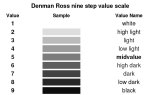
Hence in 1907 Denman Ross drew up a value scale of white to black with intervening shades of grey to help identify light, mid-tones, and darks more easily. [source]
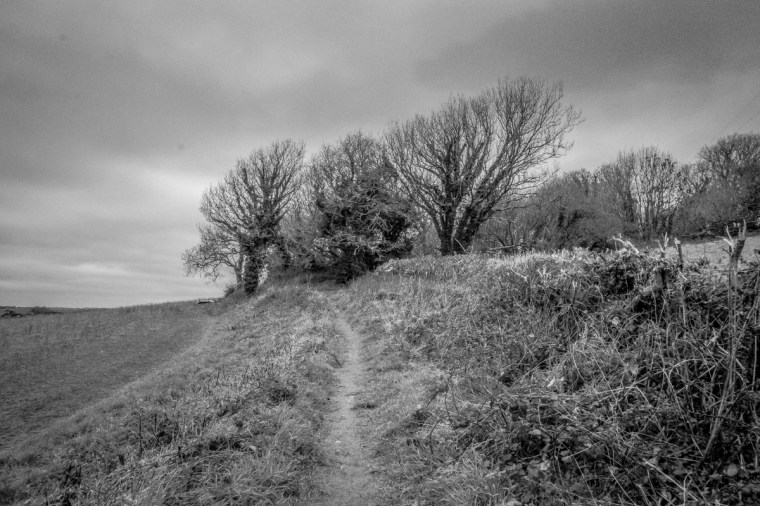
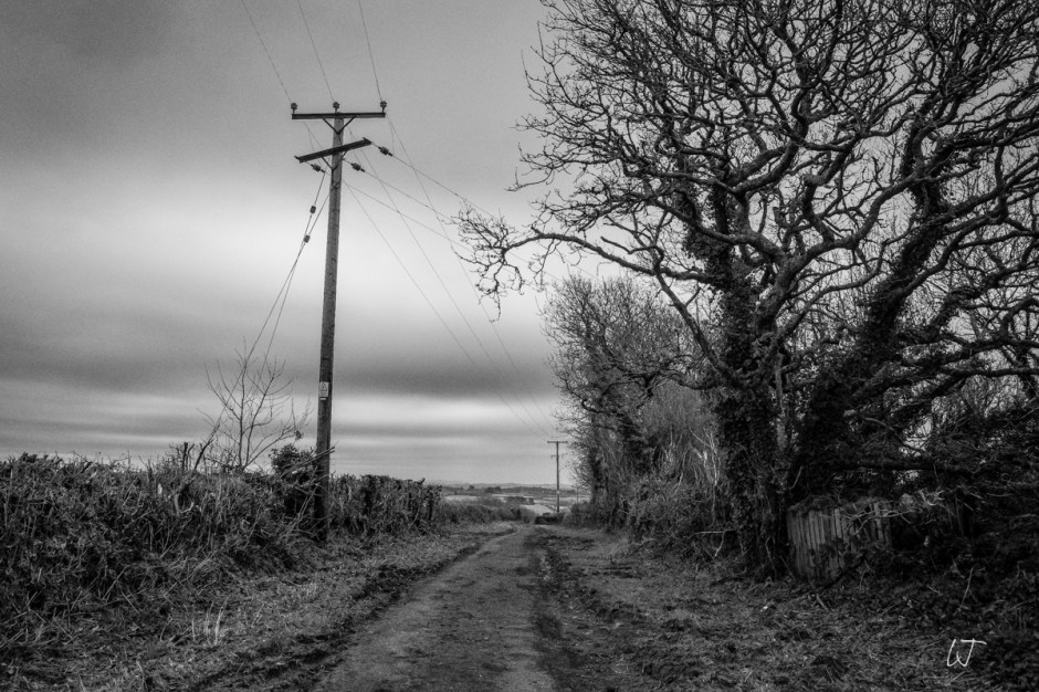
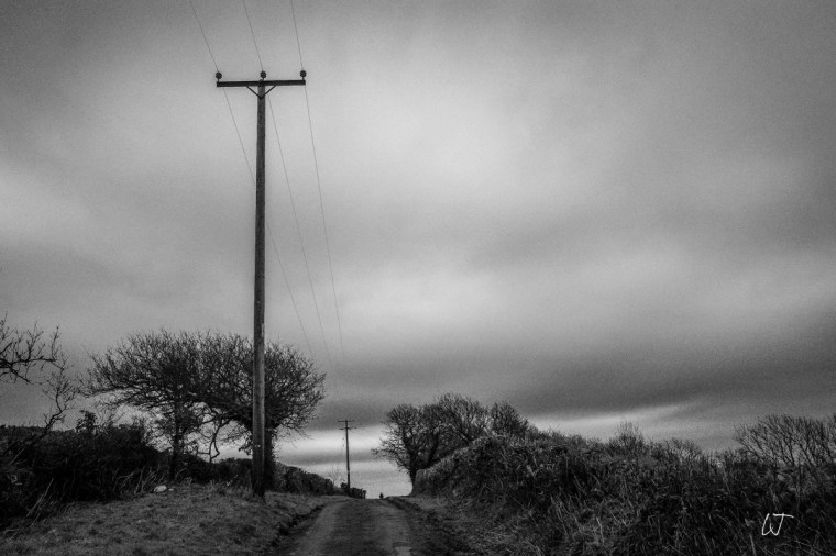
Photographs in greyscale monochrome also aim to to cover these values as per Ansel Adam’s 1930 system of 10 Zones to control exposure in film photography with depth, ranging from black to white and multiple greys in between.
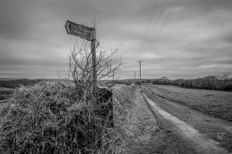
Of course Adams was capturing the drama of the American wilderness but a post-Christmas winter walk on a grey overcast day in S.W. England meant that there were few shadows, few dramatic extremes in the landscapes so I just opted for the mid values of shooting in the Ricoh GRiii monotone recipe until the light faded fast.

What an interesting post. I am aware that a good black and white photo needs to have contrasts and shades of grey, but have never considered values. Love these photos. Now I want to go out and take some myself.
once the rain stops I recommend it, Jude – these, after all, were shot in Cornwall!! My Ricoh is limited on wide angle landscapes so I had to keep attention on the fore and mid ground – and above, because that soft grey cloud bank is what drew my attention
❤️
🙂
These have plenty of drama.
I never thought of collaging in terms of values–I’m not even sure how to think about that. I just do what looks good to me. I do spend a lot of time arranging things, but there’s no theory behind it. (K)
thank you Kerfe – it’s more in relation to collaging abstracts, printing our own papers then focusing on pattern vs quiet, 3 tonal values and different shapes and sizes
Sounds like an interesting exercise.
The music is in the midrange
you’re such a poet- that is so memorable