
The beauty of digital is surely the edit facility though with image adjustments I tend to keep within one or two enhancements. Often I’ll shoot in good light condition with a low ISO and so a post camera adjustment of brightness and contrast in inevitable. However, it is more of a tweak than an adjustment as in this monochrome image of a field, which gives a touch more drama, as compared to the original below.

Just because we can does not mean we should, so since my entirely novice days, I now tend to do less editing, firstly by aiming for good framing from the outset. However in busy urban situations someone is bound to step into the frame just as the shutter is clicked, as here on the Golden Jubilee footbridge


After the crop, I also edited the colour for saturation – and then gave it a B&W layer just to see which I preferred. In this case, colour wins for me.
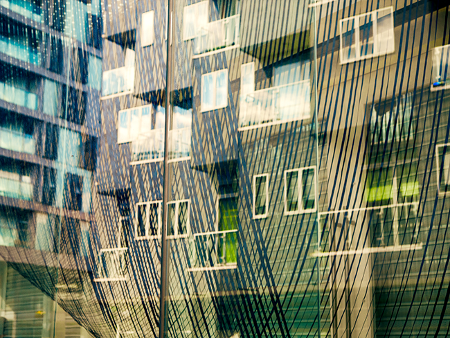
The window reflection was definitely in need of an edit and as it is quite an arty image could stand a colour change as well as zapping the contrast and brightness.

As I said at the beginning, I do try to get the framing right from the outset but the margins still catch me out – – the peeping tree (top right) was edited out with a Lightbox healing brush and since there was rather too many blobs of colour, I overlaid a B&W filter.


There are however times when I take edits much further on and into the realm of photoart with Adobe’s software – here I have been using the ‘extrude’ facility which adds a 3 dimensional touch, layering it with a monochrome sketch and a pin light blend for an added sense of drama and movement.

Linking up with the Weekly Prompts photo challenge: Edit

I particularly like that last image. I try to restrain myself when editing, but occasionally I enjoy using an art effect. Amazing really what we can do now with digital images.
thank you Jude – I only came to photography via digital so I have been spoiled with edits – at some time plan to venture into film.
Partly I edit to see if the image is worth keeping – if I cannot improve it I discard. Even the photoart edits have to be good enough images to begin with – that last multiple multiple edit works on quite a number of images – they make nice prints – sort of oil paints.
Wow! Oh Wow, that last pix is superb, the hinting of colours is fabulous. When I tweak, I have a tendency to overdo a bit usually. They are all wonderful and again the clouds is so subtle. You certainly have come a long way in the art of photography. My hat is off to you.
thank you for such positive feedback Sherwood – I usually have to control my tendencies when it comes to edits so the photoart is an excuse for a free rein
For the colour version I love how the middle one of the footbridge turned out, but ultimately I prefer the b&w one, I think it’s because there’s so much going on in this picture and the b&w tones that down a bit.
The artsy reflection is great, I like how the colour came out. As for the tree in the water view, I don’t really mind that. I sometimes try to frame a pic so that a bit of tree is hanging into the pic.
The last one is definitely a very artful eye catcher to me. Although I do edit, that would have been too much work for me 🙂 . I often make do with a Lightroom preset; that way I make it obvious it’s been edited but not in a way you often see overedited landscape pics that pretend to be original.
thanks for your opinions Kiki – the tree hanging is fine when entering as framing but the itsy bitsy bit that intruded was a detraction. I use Lightroom presets sometimes too but am venturing into the Photoshop menus more and more when I want to create photoart – and then it is obvious!
Your photos are lovely and your edits sympathetically achieved and so beautifully explained. Thank you for joining us for this Weekly prompts challenge.
so glad to have found your prompts – thank you Sue
We’re delighted to have you with us. 🙂
I too like the last one. It is interesting and different, without that uncomfortable has had work done look I so often see.
thank you Diana – I think photo edits should either be subtle or artfully OTT – the in between never looks quite right